Love letter: reimagining a tabletop favorite with a fresh visual identity and multi-screen play

End-to-End Product Designer & Illustrator•Passion Project•Multi-device (Mobile + TV)
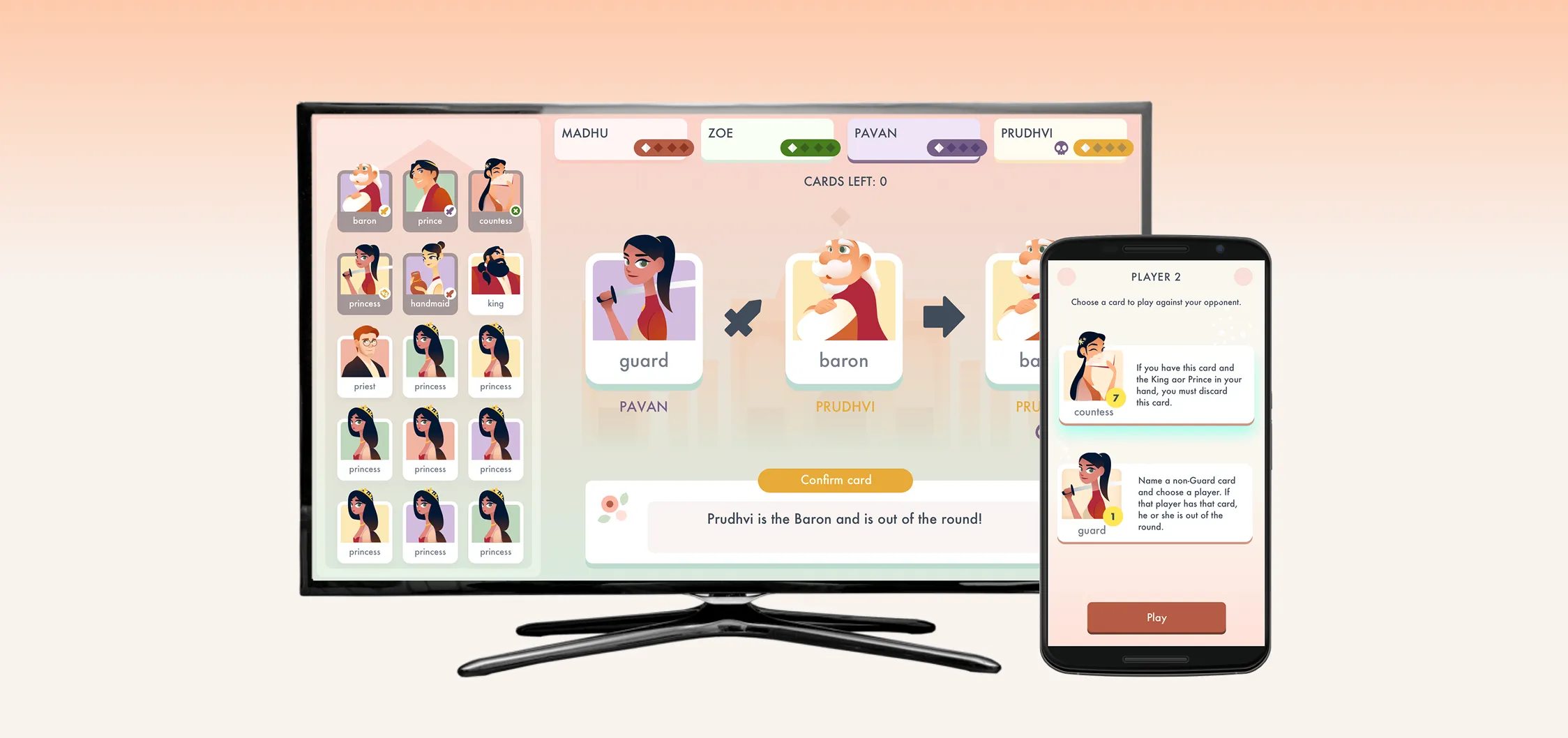
Project Mockup
Project summary

Translating physical tabletop dynamics into a synchronized digital game

The opportunity

A friend and I loved the card game Love Letter and wanted to modernize it. We set out to replace the dated art with an inclusive visual style and turn the physical card game into a synchronized digital experience.

The outcome

Illustrated a fresh visual identity from scratch and built a multi-device UI (Mobile + TV) that cleanly balanced shared public context with private player hands.

Context

Rebranding a classic game for a modern, inclusive audience

The starting point

While the original game was a classic, the art style felt a bit traditional and distant from modern, mainstream aesthetics. My first goal was to reimagine the visual identity to be contemporary and highly inclusive.

Goal

Create a whimsical, inclusive art direction (inspired by Monument Valley) featuring racially diverse characters, and build a digital infrastructure that allowed four players to use their phones as private hands while a central TV acted as the shared game board.

Challenge

Designing a “second screen” experience is notoriously difficult. We had to perfectly synchronize private mobile states with public TV states so players never felt lost or disconnected from the room.
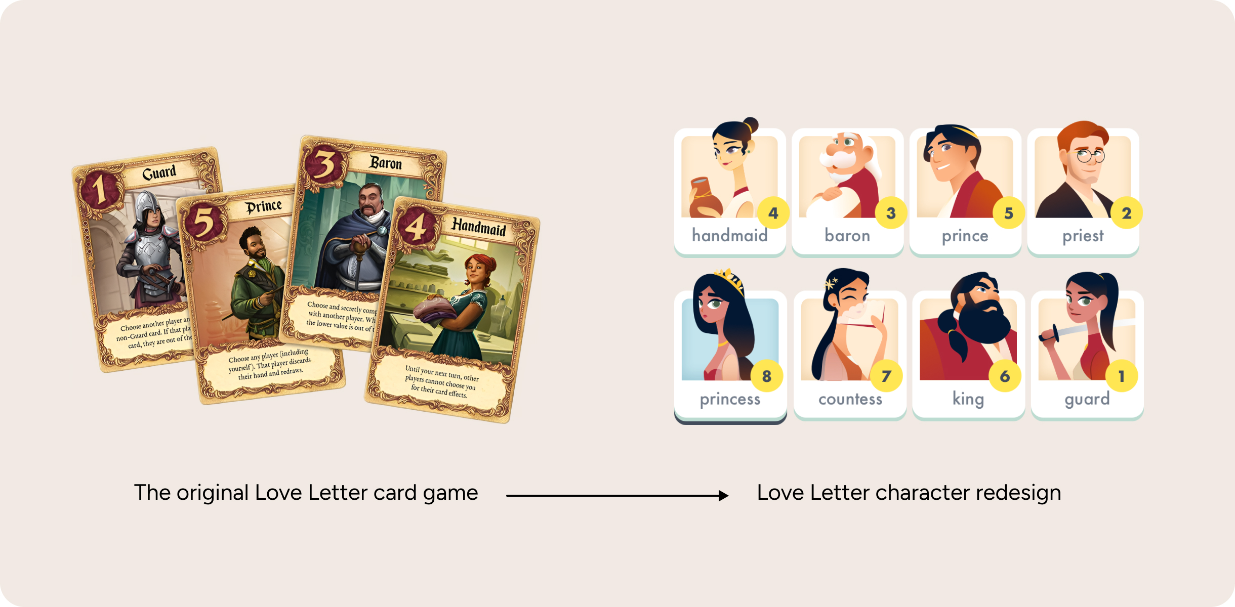
Original card design compared to new Love Letter character redesign
Synthesis & iteration

Prototype #1 failed because it isolated the players

Broken party dynamic

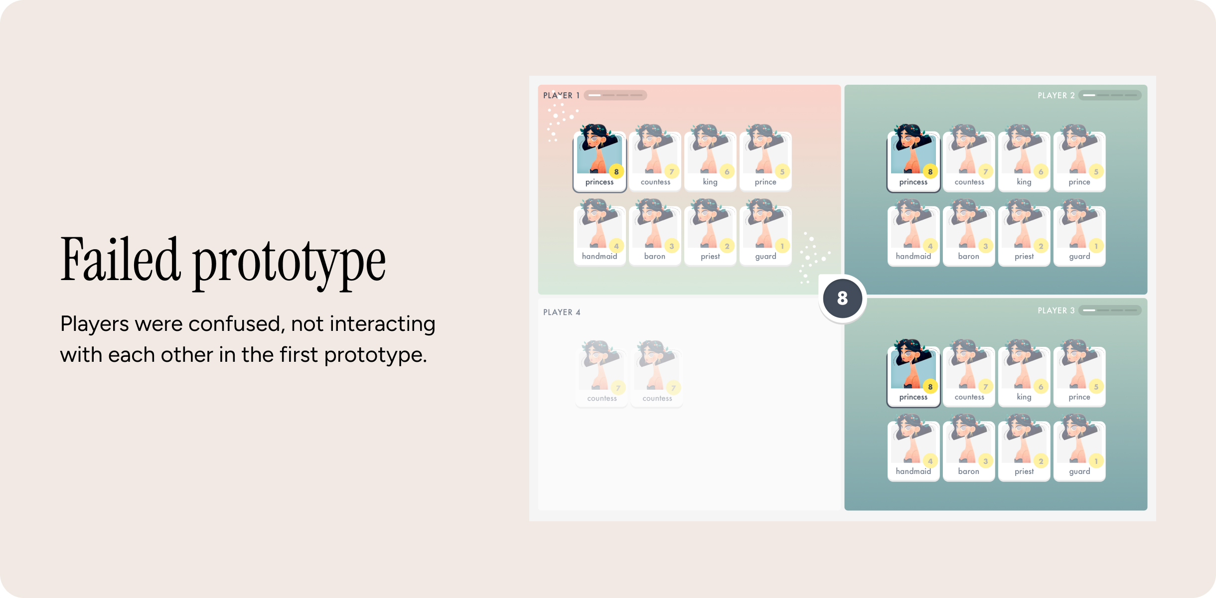
Our first prototype was a disaster: the game lost all its party energy. In a physical card game, players talk and make eye contact to establish game state, but here, players retreated into their personal screens and stared blankly at their phones. Nobody communicated, nobody knew whose turn it was, and players were confused by a TV UI where too many things were happening at once without a clear focal point.

Assumption

If we forced the TV to act as a hyper-clear, single point of focus, and strictly limited the mobile screens to private action-taking, we could force players to look up and engage with the room.

Failed prototype: players were confused and not interacting with each other
The solution

Separation of concerns: TV for context, Mobile for action

Stripping mobile context

I completely redesigned the layout for Prototype 2. We stopped trying to put game context on the phones.

Dual-screen information hierarchy

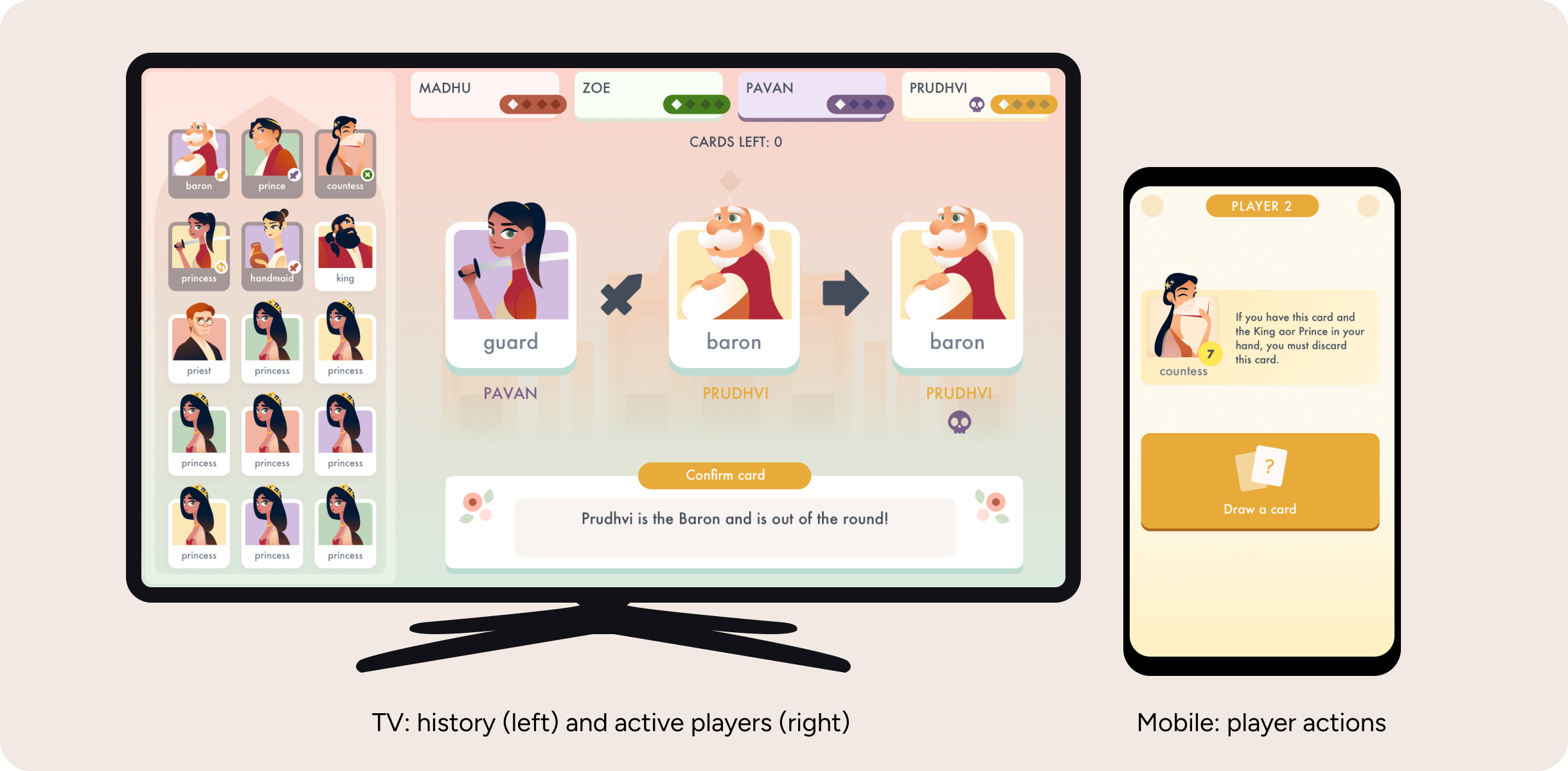
I created a strict hierarchy of information. The TV UI was redesigned to have one massive focal point, constantly providing visual feedback on who was actively playing and what had just happened. The mobile UI was stripped down to only show private cards and actionable buttons. I also introduced a dedicated in-game messaging area and custom iconography to explicitly explain player actions, bridging the gap between virtual inputs and physical reality.

TV: history (left) and active players (right), Mobile: player actions

Outcome & impact

Revived party energy

The strict separation of TV context and Mobile action worked perfectly. Players instantly knew what was happening when they looked at the TV, forcing them to stay engaged with the room rather than staring at their phones.

Multi-device experience

Friends couldn't put the new version down. We successfully translated the complex rules of a physical card game into a seamless, multi-device digital experience.

Reflection

Preserving party energy when devices guide the action

The real challenge on this project was preserving the room’s party energy when players naturally look down at their screens for instructions. The moment people get confused by rules or lost in complex mobile menus, the conversation stops and the social dynamic dies.

I needed to create a shared space where players could continuously talk, bluff, and interact with each other, while keeping the phone focused strictly on key actions that helped them take their next step quickly and confidently. Choreographing that balance between shared room context on the TV and fast, distraction-free inputs on mobile completely reshaped how I think about multi-screen UX.