Redesigning Zillow's Notification Center: unifying 10 years of fragmented communications

Lead Product Designer (Growth & Product Communications)•Zillow•iOS, Android, and Web
Project summary

Modernizing a 10-year-old communication engine by balancing user autonomy with business retention

The problem

Notifications drove 30% of Zillow’s traffic, but an outdated system bombarded users with relentless alerts they couldn’t easily manage. With over 400 complaints pouring in monthly, users felt spammed, while leadership feared that simpler opt-outs would trigger mass churn and hurt agent bookings.

The outcome

I shifted my team from running low-impact email A/B tests to rebuilding the notification center from the ground up. By presenting regularly at team and leadership meetings, I helped leadership see that transparent preference controls build user trust rather than cause churn. As a result, I aligned 10+ stakeholder teams and delivered a cross-platform hub across iOS, Android, and Web that achieved 100% platform parity and protected domain deliverability.

Context

Overwhelming alerts flooded users, while a backend team lacked frontend ownership

The user problem

Zillow’s 10-year-old notification system relied on involuntary subscriptions. Taking common actions on the app or site, like saving a search or saving a home, triggered multiple daily alerts and monthly market reports. Meanwhile, mobile users had no clue that in order to turn off email notifications they’d have to go to their laptop and use the web notification center. Frustrated, users submitted 400+ complaints a month (80% demanding to unsubscribe) while ISPs like Gmail began flagging Zillow as spam.

The organizational blocker

The system hadn’t been touched in a decade. My team (Growth & Product Communications) had always managed the governance of email and push notifications (off-site experiences). Because the team only had backend talent, there was no one on the frontend to improve the on-site notification opportunity, while 10+ siloed product teams launched independent marketing alerts without coordinating.
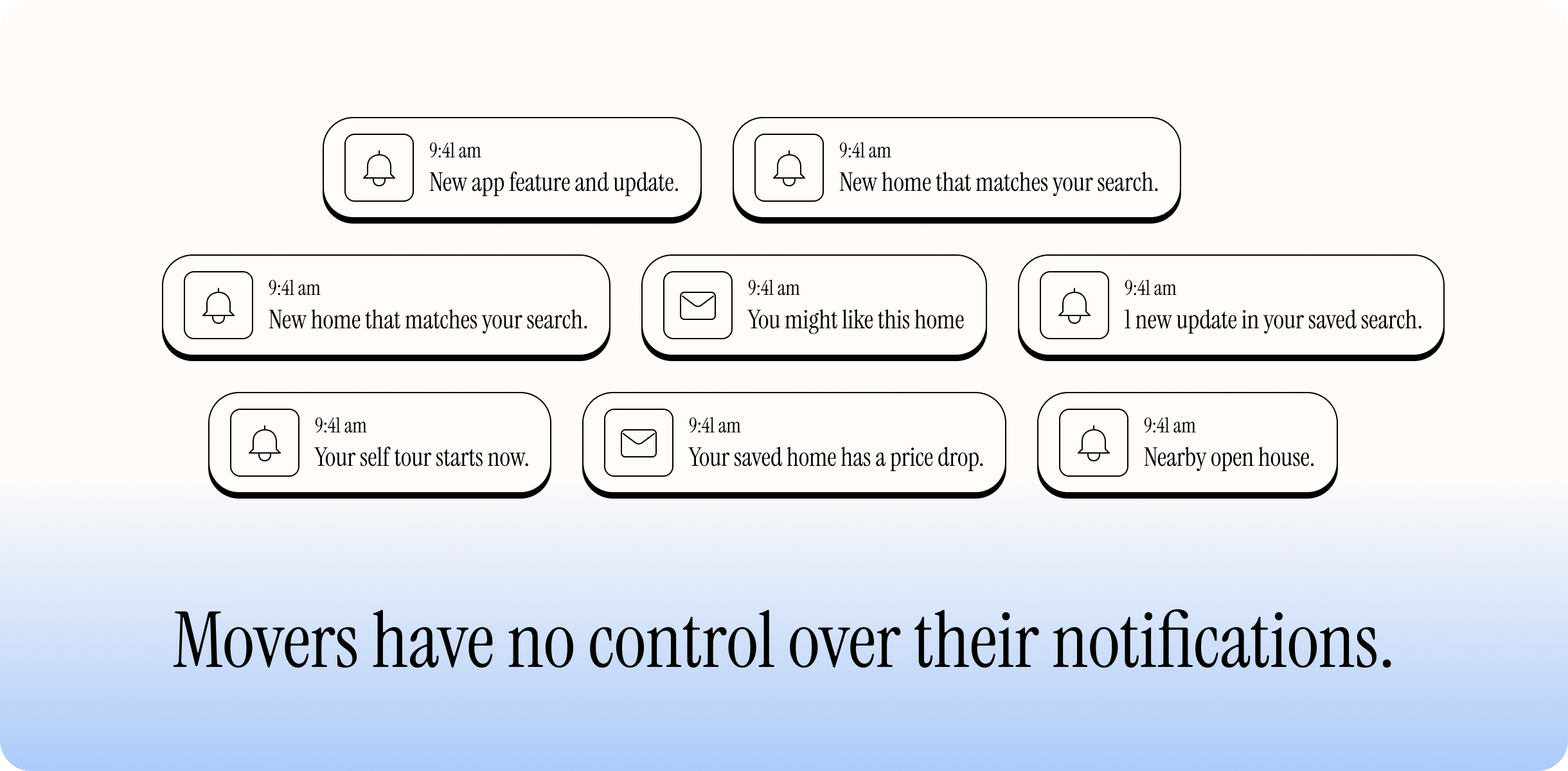
Movers cannot customize notifications
The pre-work

Laying the groundwork before touching a single screen

Pitching the turnaround

My team was stuck in maintenance mode, spending cycles on low-impact email A/B tests instead of addressing the core product. To secure buy-in for a ground-up rebuild, I presented regularly at team and leadership meetings. By connecting our broken experience to the 400+ monthly customer complaints, I reframed the notification center for leadership: transparent controls were not a churn risk, but our best opportunity to rebuild user trust.

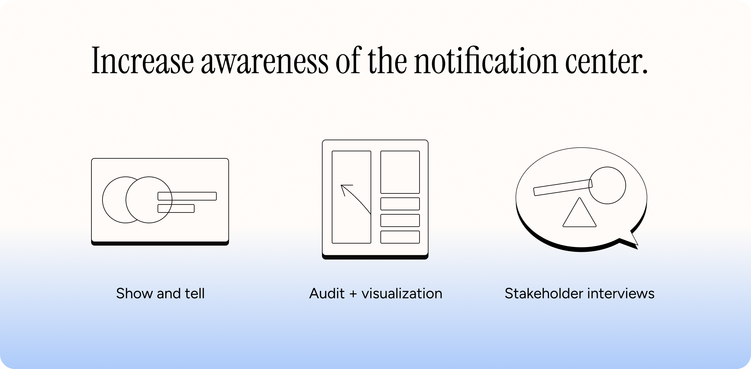
The comms audit & visualization tool

To convince my team to rebuild the notification center from the ground up and secure frontend headcount, I conducted a comms audit and built a visualization mapping the complete user journey: from app download, to actively receiving alerts, to modifying preferences. This revealed a fundamental gap—users had no way to tell Zillow what they actually wanted—helping the team realize that personalization and customization are essential to driving relevant notification delivery, and that relevancy is also the key to driving higher submit (agent booking) rates.

Aligning 10+ siloed stakeholder teams

Before drawing a single screen, my product partner and I identified and interviewed leaders across 10+ product teams to catalog every comms stream they owned. By establishing continuous review check-ins and iterating together whenever changes touched their domain, we transformed cross-team territorial friction into shared buy-in.

Cross-team stakeholder alignment and comms audit
Synthesis

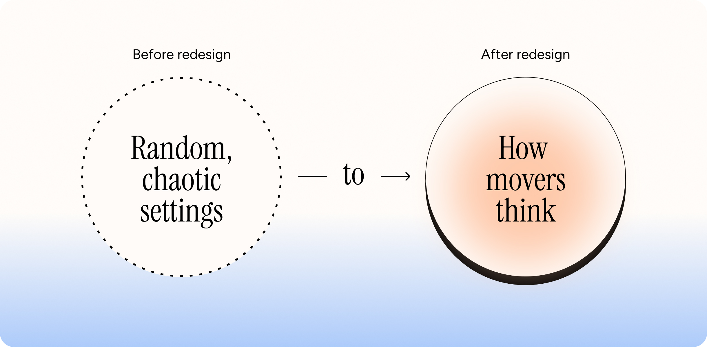
Unifying web and mobile around how movers think

The architectural flaw

Web and mobile ran on completely separate platforms, and our team only owned web. While web allowed users to manage both email and push, the old web experience suffered from UI flaws, lacked crucial customization controls, and wasn’t built to manage a large number of communications for older users. Mobile was even worse: users couldn’t manage email at all, the settings were disorganized, and leftover toggles remained for teams that were no longer sending notifications.

The mental model

Through user interviews and card sorting, I discovered that movers naturally group communications into three intuitive buckets:

  • Home search: Price drops, new matches, and open houses
  • Market reports: Home values, neighborhood trends, and seller updates
  • Account & direct comms: Agent replies, tour requests, and landlord notes

The validation

I re-architected the entire information architecture around these three categories. When I tested the new structure with users via tree testing, I achieved an 83.5% first-click success rate for discovering and modifying notification preferences.

Synthesis visualization
The solution

A unified control hub that empowers movers with precise control, transparency, and seamless parity

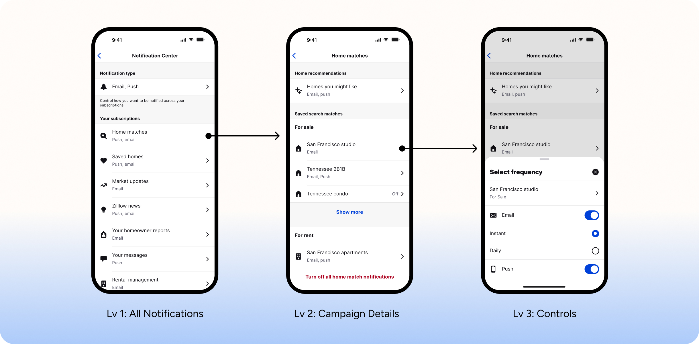
3-tier information architecture

To give movers full transparency over what they receive, I replaced backend jargon with a clean, three-level hierarchy:

  • Level 1 overview: Displays a high-level summary of the three primary communication categories at a glance.
  • Level 2 campaign details: Organizes specific communication types, such as saved searches versus saved homes.
  • Level 3 delivery controls: Gives movers granular control over email and push delivery, letting them choose instant alerts, daily summaries, or turn notifications off entirely.
Solution visualization

Thoughtful friction on opt-out

To align with leadership’s retention goals while honoring user choice, I designed friendly, intentional friction into the unsubscribe flow.

Instead of letting users impulsively turn off everything when frustrated by a single alert, a contextual drawer prompts them to review and customize specific notification types first. To keep the experience honest and transparent, I placed the global opt-out option prominently at the top of the screen.

Core mobile UI primitives

To keep movers focused and ensure rapid scanning on smaller screens, I introduced two primary interaction patterns for the mobile app:

Lists: Clean, structured rows that allow users to easily digest campaign details.

Contextual drawers: Tapping a communication slides up frequency controls, allowing users to quickly curate their inbox without losing their place on the main screen.

Responsive desktop parity

To ensure a consistent cross-platform experience that reduces cognitive load, I translated the mobile UI into expandable accordions for desktop web. This allows users to configure multiple preferences simultaneously on a single screen without endless page reloads.

Conditional disclosure & external links

To reduce clutter for the 62% of buyers who never search for rentals, the rental section conditionally appears at the bottom only if a user has active rental searches.

External management links within settings provide an efficient hand-off for movers to directly delete outdated saved searches and saved homes.

Outcomes & impact

83.5%
Success rate

Tree testing validated an 83.5% first-click success rate in navigating and modifying notification preferences across the unified architecture.

100%
Platform parity

Delivered a consistent control hub across iOS, Android, and Web, finally enabling users to manage email subscriptions directly on mobile.

Protected deliverability

Stopped the backend from blasting years-old emails to inactive users, helping preserve Zillow's critical sender reputation with providers like Gmail.

Unified 10+ siloed teams

The new architecture brought 10+ siloed product teams under a single framework, granting users complete visibility into their comms.

Trade-offs

Balancing user autonomy and retention

Leadership feared that easy unsubscribe controls would cause mass opt-outs and hurt agent bookings. I resolved this with thoughtful friction: keeping a global opt-out clearly at the top of the screen for trust, while using contextual drawers to help users prune stale searches instead of turning off all alerts. This protected business retention while ensuring users only received high-intent, relevant communications.

Reflection

Systemic change takes trust and time

Designing through organizational structural constraints and a decade of legacy decisions taught me that systemic change is never instant. I did not regret the time invested. It took me two years to conduct a proper audit, master the product domain, and build cross-functional trust before I could turn insights into actionable changes that drove real impact across 10+ teams.