How I used AI to build a portfolio defined by visual craft and performance

AI Designer•Web (Desktop & Mobile)•Figma, Antigravity, Gemini, Astro, Tailwind CSS, Cloudflare
Project summary

Proving that strong design taste and AI orchestration can deliver high visual craft and performance

The problem

Building a custom portfolio usually requires learning to code, hiring a developer, or settling for rigid templates with monthly fees. With zero coding background, I needed a way to bring my exact visual standards and interactions to life without technical roadblocks.

The outcome

Directed free AI tools to build and publish a custom portfolio from scratch with zero manual code. Achieved high visual craft, fluid interactions, and fast load times purely through clear creative direction and live browser testing.

Context

Turning tight constraints into a creative opportunity

The starting point

I wanted a custom portfolio with smooth animations and responsive polish. While many designers turn to Framer, it has a steep learning curve and a recurring subscription just to publish. Instead of defaulting to another heavy, paid software suite, I saw an opportunity to rethink the build process.

The constraint

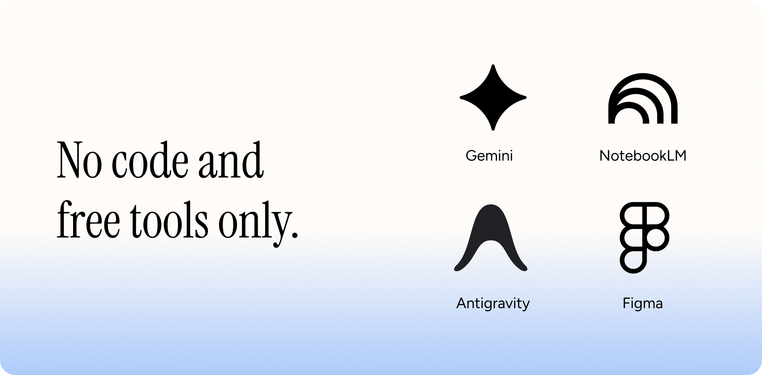
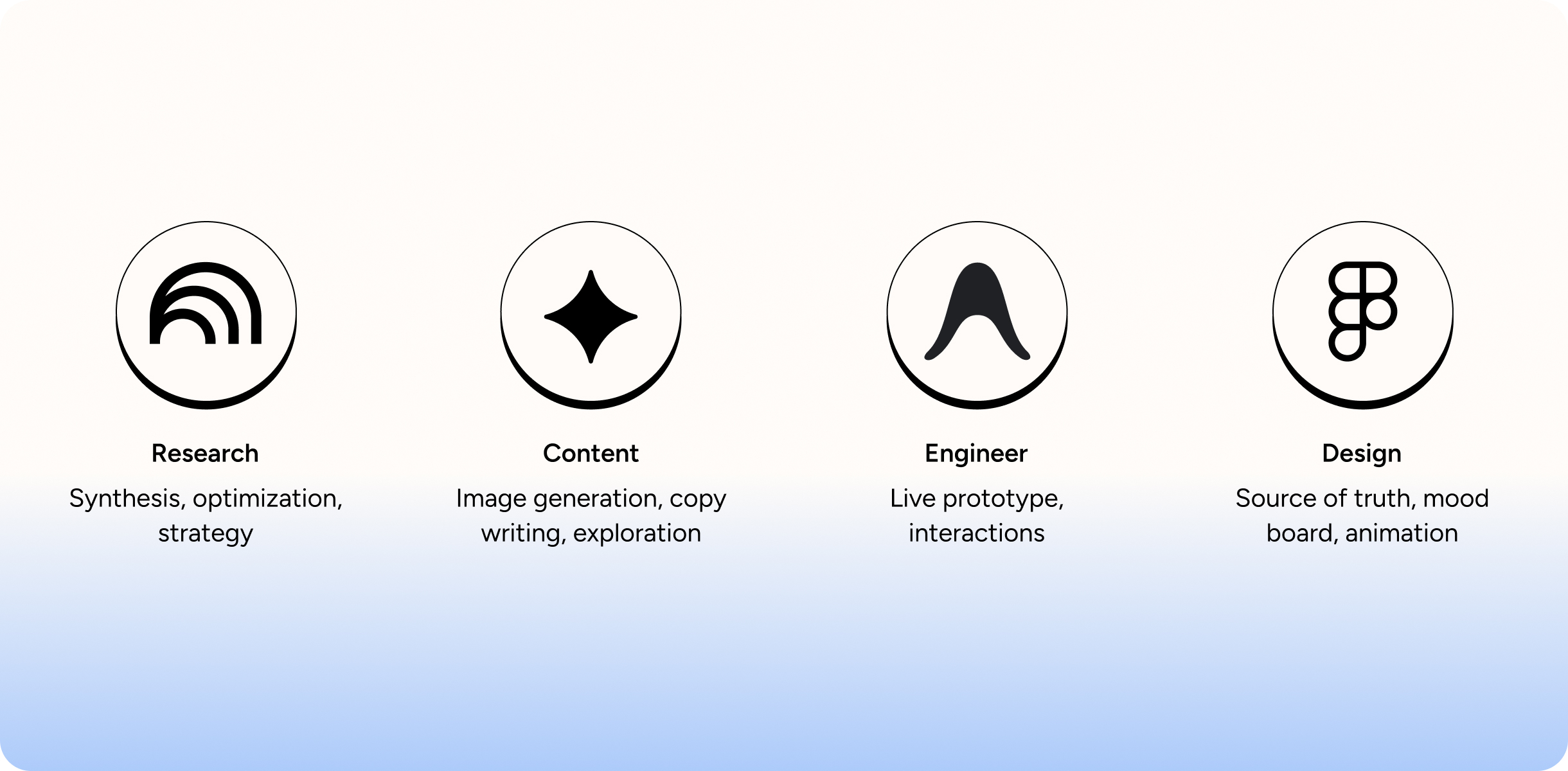
Rather than investing in multiple paid AI tools, I set a deliberate creative boundary: rely only on tools I already had for free: Figma, Gemini, Google Antigravity (an AI coding tool), and Cloudflare for hosting. To achieve fluid motion and fast performance without bloated templates, I had Antigravity build the foundation with Astro and Tailwind CSS, using JavaScript for custom animations. I treated these limits not as a handicap, but as an experiment in resourcefulness to see how far pure design taste could push a lean setup.

Zero manual code

My rule was strict: write zero code. Over eight years in product design gave me an intuitive grasp of layouts and responsive systems, but I am not an engineer. Committing to zero code pushed me to be a clearer creative director, guiding the build entirely through everyday language, visual feedback, and precise critique.
Context visualization
Design system

Turning static Figma mocks into a living system

Visual ground truth

Instead of using plugins or vague prompts, I shared screenshots and exact values from Figma for fonts, colors, and spacing. This gave the AI a clear target, so the first build matched my design down to the pixel.

Responsive across devices

Antigravity generated the initial layout fast, but layouts don’t adapt to smaller screens on their own. I stepped in to test and adjust the design across mobile, tablet, and desktop, making sure the layout felt natural on every screen.

Global theme tokens

To keep the site consistent, I had Antigravity turn my design rules into a shared design system using Tailwind CSS tokens and reusable Astro components. This locked in my colors, fonts (Instrument Serif and Figtree), and card shapes across every page.

Content and asset preparation

Preparing content was just as critical as building the UI. I structured each case study as a clean markdown document so copy could be edited without touching layout code. For media, I used Gemini to create contextual backgrounds for device mockups and set up automated scripts to fit screen recordings neatly into device frames.

Design system visualization
Challenges

Resolving interaction bugs

Interaction bugs

When building interactive components like the project carousel, trackpad gestures caused cards to jump vertically and drift unpredictably. Static layouts were easy for the AI to generate, but explaining interaction bugs in plain English without an engineering vocabulary was tricky.

Resolving the bugs

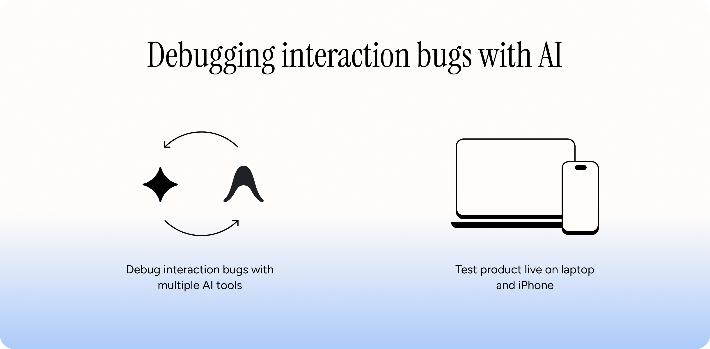
Instead of writing code, I used a back-and-forth process between two AI tools. I described the glitchy behaviors in plain English to Gemini, had it debug the logic, and fed the suggested fixes back into Antigravity. I tested it live on my laptop and iPhone to make sure the interactions worked smoothly across every browser.

Challenges visualization
The solution

Balancing editorial pacing with live browser performance

To turn tight constraints into an engaging reader experience, I approached the portfolio as an editorial product. I structured the narrative around focused single-scroll views and recognizable visual anchors, using AI as a collaborative design partner to achieve fluid cross-device polish with zero manual code.

One focus per scroll

To respect a reviewer’s limited time, I paced the site like an editorial presentation where each scroll view holds a single clear focus. Inside every case study, an executive summary sits right at the top so readers immediately see the problem and outcome without hunting.

Cognitive load and credibility

I kept copy tight with zero filler and prominently featured recognizable company brands to establish trust in seconds. Grouping work by areas of expertise with visual anchors helps recruiters map my skills directly to open roles.

Cross-device polish

I tested across desktop and mobile on Chrome and Safari, verifying color contrast for readability. On mobile devices, I deliberately disabled desktop animations to keep load times instantaneous and scrolling smooth.

AI as a design partner

Beyond generating code, I used AI as an objective critic. It challenged my spacing, explored layout alternatives, and suggested adding the company logo showcase to reinforce credibility across the entire site.

Outcome & impact

Visual taste

Instead of settling for cookie-cutter templates or generic AI layouts, I stayed completely true to my visual standards. Guiding the AI with my own design rules let me express my unique aesthetic and build a site that stands out from standard portfolio themes.

Live performance

Figma can only simulate interactions, but AI allowed me to test and refine the site live in the browser. Testing real scroll momentum, fast load times, and fluid responsiveness ensured a level of execution quality that static design tools cannot achieve.

Reflection

Why I protect my own creative direction

Where automation falls short

AI moves fast on basic layouts, but nuanced polish still demands relentless human scrutiny. Without an engineering background, diagnosing complex interaction bugs and layout edge cases remains a real bottleneck. AI can generate code in seconds, but it cannot evaluate whether an interaction actually feels right to a human user.

A production partner, not a creative lead

This project clarified how I see AI fitting into my workflow. AI is not a creative director; it cannot replace taste, empathy, or strategic product judgment. Instead, it acts as an agile production partner, removing technical friction so I can focus where my time matters most: on user experience, visual craft, and product direction.