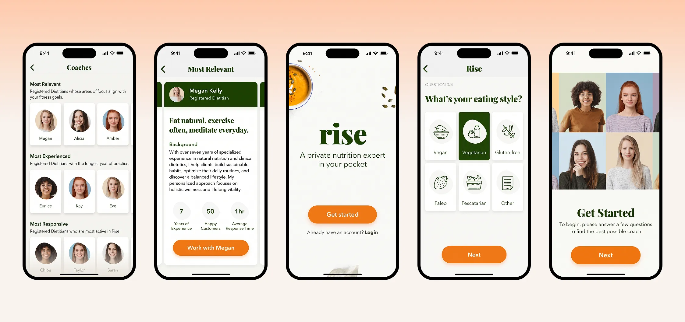
A design concept for Rise that helps users confidently choose a personal nutrition coach

Product and Visual Designer•Concept•iOS
Project Mockup
Project summary

Redesigning onboarding and dietitian discovery to replace a blind paywall with transparent matching

The hypothesis

Rise’s onboarding suffered high drop-off because it required payment info before users could evaluate dietitians. I hypothesized that letting users browse and compare dietitian profiles upfront would establish trust and drive subscription conversion.

The outcome

Rebranded the iOS app for credibility, structured dietitian profiles into scannable cards with transparent criteria, and streamlined checkout into a single-screen flow.

The friction

Committing to a dietitian without knowing if they're the right fit

The starting point

Early in my career, I worked on this as an interview take-home challenge to diagnose onboarding friction under tight constraints. Coming in with fresh eyes, the problem was obvious: Rise demanded a credit card before users could browse coaches, and bios were dense walls of text. Instead of feeling supported, users were asked to commit to a stranger.
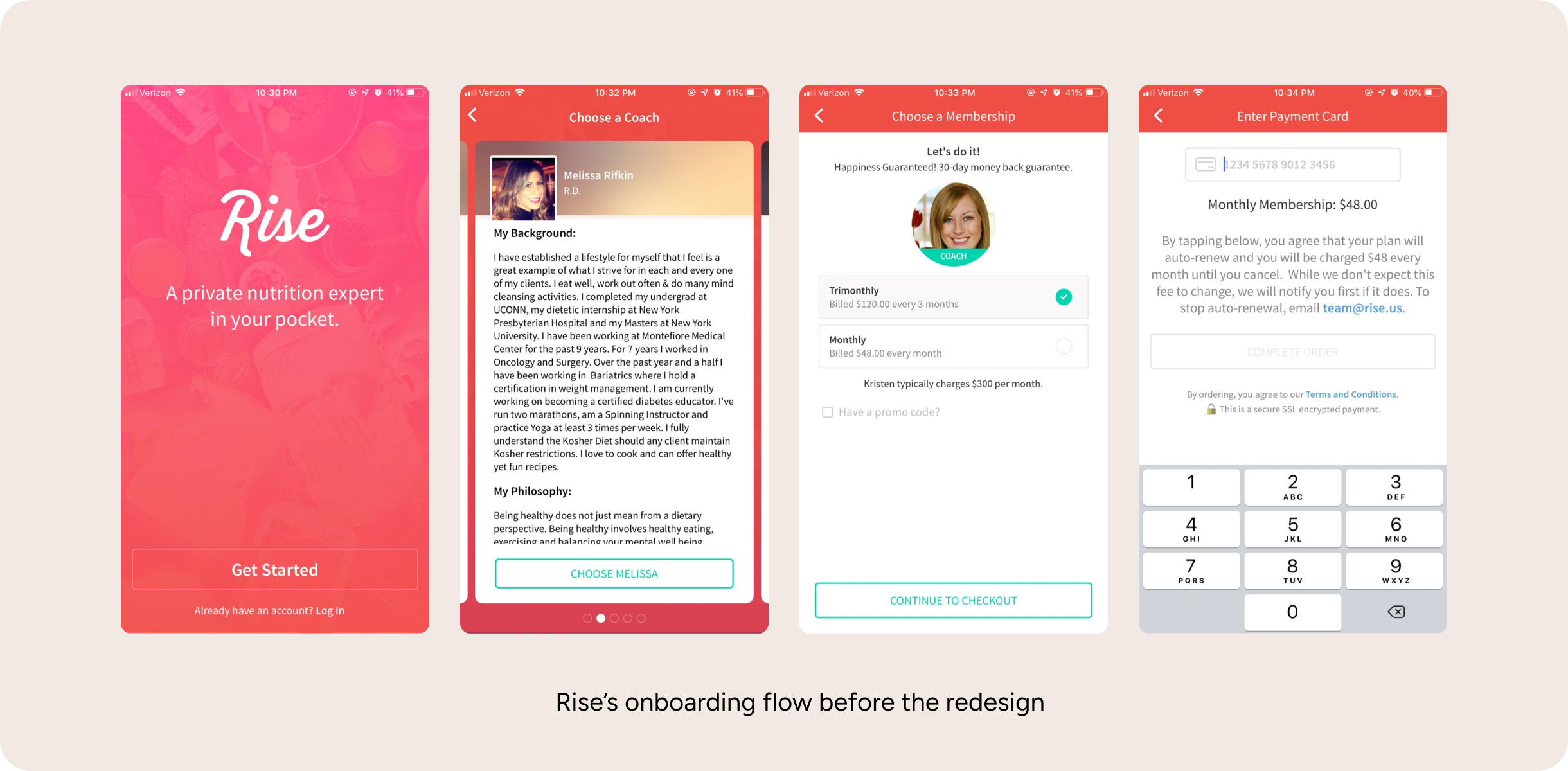
Rise's onboarding flow before the redesign
The solution

Digestible comparison over wall-of-text bios

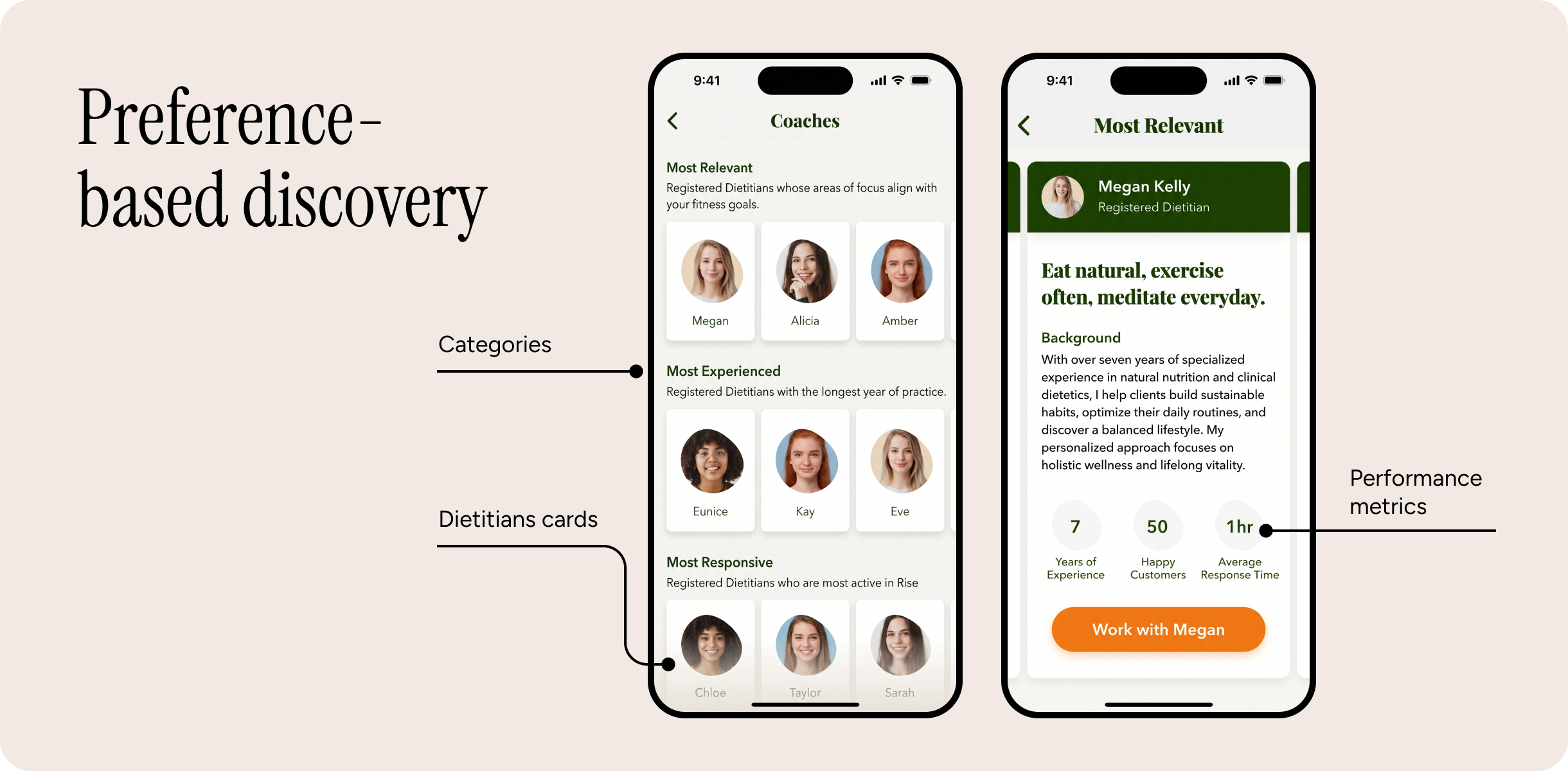
  • Scannable profiles: I replaced unformatted essay bios with structured cards (10-word philosophy, 300-word bio cap, and performance metrics) to eliminate cognitive overload and help users evaluate coach fit at a glance.
  • Preference-based discovery: I categorized dietitians by user priorities (most relevant, responsive, experienced) so users could evaluate coach strengths through transparent criteria instead of guessing.
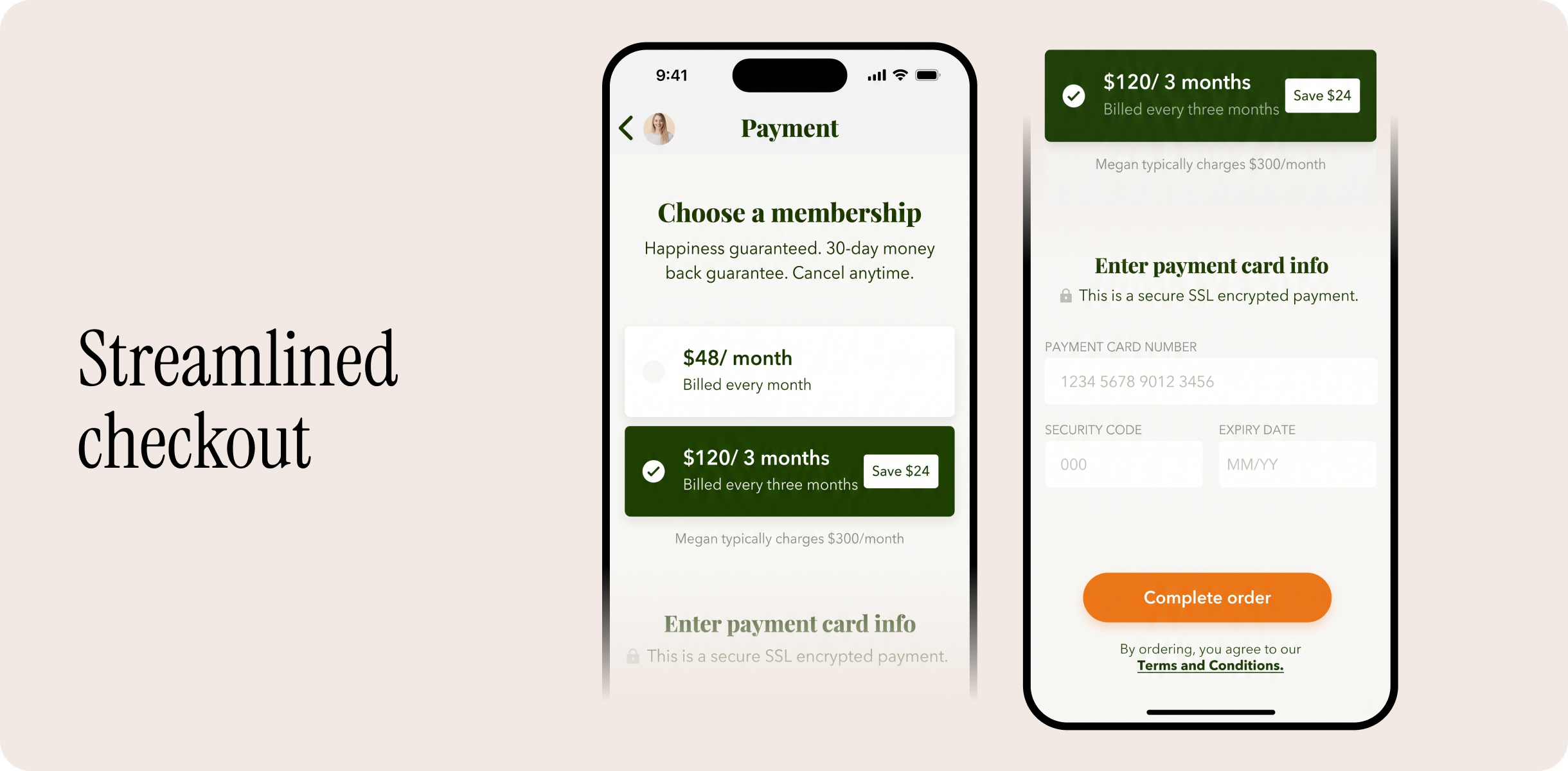
  • Single-screen checkout: I merged plan selection and payment into one screen with auto-focused card entry to remove unnecessary transitions and reduce drop-off at the point of conversion.
Preference-based discovery
Streamlined checkout
Trade-off & reflection

Building trust through transparency and streamlined flows

I prioritized scannability over the dietitians’ creative expression, eliminating undistilled walls of text to prevent user fatigue. Through this exercise, I learned that one of the best ways to build trust is to make information accessible and transparent, while eliminating unnecessary steps to reduce drop-off.